A logo does more than represent your brand visually—it signals credibility, intention, and values within seconds. Whether you're launching a SaaS startup, building an e-commerce brand, or promoting a new tool, your logo is the silent ambassador of trust. But trust isn’t random. It’s built through a careful mix of design psychology, strategic choices, and consistency.
In this article, we’ll explore the science behind logos that foster trust—and how you can apply these principles to your own brand.
People don’t just buy products—they buy confidence in a company’s ability to deliver. That confidence often begins with visual perception. Research in cognitive psychology shows that humans make judgments within millisecondsbased on appearance. And logos play a central role in shaping those judgments.
A logo that evokes trust:
That’s why investing in a trust-building logo is never just “aesthetic”—it’s strategic branding infrastructure.
While trends come and go, trust is built on psychological constants. Let’s break down the factors that make a logo feel safe, stable, and dependable:
Let’s explore some of these in depth.
Color is one of the most immediate triggers for emotion. People subconsciously associate certain hues with specific traits—making your color choice a key part of your trust equation.
Mini-case: A cybersecurity startup used navy blue and slate gray in its logo. This combination immediately suggested stability, privacy, and professionalism—key signals for an industry where trust is everything.
The human brain responds to shapes faster than words. By using form strategically, you can encode meaning into your logo without adding complexity.
Circular shapes are interpreted as friendly and inclusive. Think social platforms or wellness apps.
Squares and rectangles evoke structure, trust, and authority—perfect for enterprise software or legal services.
Triangles suggest direction, speed, or innovation, but their sharpness can also imply risk—so they’re best used with balance.
Organic shapes (waves, spirals, flowing lines) tend to feel natural, human, or tech-forward—great for new-age SaaS or AI tools.
When designing a trustworthy logo, prioritize clarity and balance over artistic complexity. People need to feel like they understand your visual message at a glance.
Typefaces silently convey tone, speed, and credibility. A serif font, with its traditional flourishes, suggests history and trust. A geometric sans-serif looks more modern and efficient.
Tip: Avoid novelty fonts unless your brand tone is explicitly playful or informal. Trust is easier to earn when the design feels intentional, not experimental.
Even a well-designed logo won’t build trust if it’s used inconsistently. Your brand’s credibility is reinforced when your logo is applied consistently across all touchpoints:
Trust is pattern-based. If your visual identity changes frequently or feels messy, users subconsciously question your professionalism.
A logo doesn’t operate in a vacuum. It works best when it’s part of a larger, aligned brand system. Here's how your logo contributes to trust when applied correctly:
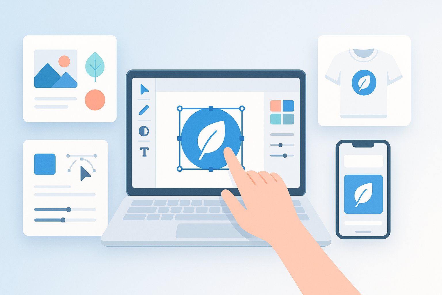
Mini-case: A tech founder used a logo generator to create a logo with AI for his task management tool. The result was a sleek, trustworthy design that immediately elevated the product’s perceived professionalism. When the same logo was applied to the product UI, blog visuals, and social content, users commented on the “polished” experience—proving trust isn’t just about design, but how it's deployed.
How do I know if my logo is trustworthy?
Test it in multiple sizes and formats. Ask people what it makes them feel. If they say “clean,” “professional,” or “reliable,” you're on the right track.
Should I always use blue if I want trust?
Not necessarily. Blue is popular for a reason, but trust can be built with any color—if it's consistent, balanced, and suits your industry.
Can a logo generator create a trustworthy logo?
Yes, especially if the generator uses design principles like spacing, alignment, and color psychology. The key is to customize with strategy.
What’s more important: uniqueness or trust?
Both matter—but without trust, uniqueness can backfire. A simple logo that evokes confidence will always outperform a clever one that confuses.
Can I redesign my logo if it doesn’t build trust?
Absolutely. A logo refresh is a strategic step for evolving brands. Just make sure the new design aligns with your mission and audience.
Designing a logo that builds trust isn't about trend-hopping or flashy visuals. It’s about understanding how people think, feel, and react to shapes, colors, and patterns. With the right strategy and attention to psychological cues, your logo can do more than look good—it can make people believe in what you’re building.
This article was prepared by a Turbologo expert.