Your logo isn’t just a graphic—it’s your brand’s first pitch. It introduces your business, sets the tone, and tells customers whether they can trust you. And while most people think logos are about beauty, the best ones do more than look nice: they convert.
In this article, you’ll learn the core strategies behind designing a logo that actually sells. Whether you’re launching a startup, refreshing your identity, or building a side hustle, these insights will help you turn your logo into a growth asset—not just a placeholder.
Why Logos Influence Buying Decisions
People process images faster than words. A great logo creates an instant emotional reaction, communicates credibility, and sets your product apart.
Impact Area | How a Logo Affects It
|
Perceived value | A polished logo signals quality, even before a purchase |
Trust and credibility
| People trust brands that feel cohesive and consistent |
Brand recall | Simplicity and uniqueness make it easy to remember
|
Differentiation | Your logo visually separates you from competitors |
In short: your logo can either attract leads—or lose them.
The Psychology Behind Logos That Sell
Let’s look at the key principles that drive conversion-focused logo design.
1. Color Psychology
Colors evoke emotions—and emotions influence buying behavior.
Color | Associated Feelings
| Great for… |
Blue | Trust, stability, intelligence
| Tech, finance, SaaS |
Red | Energy, passion, urgency | Food, fitness, ecommerce |
Green | Growth, health, sustainability | Wellness, eco-brands, finance |
Black | Power, luxury, sophistication | Fashion, high-end products |
Yellow | Optimism, friendliness, speed | Delivery, education, entertainment |
Tip: Stick to 2–3 colors max. Too many dilute your message.
2. Shape Language
The shape of your logo influences how people perceive your brand:
- Circles and curves: friendliness, inclusiveness
- Squares and rectangles: reliability, order
- Triangles: action, speed, progress
- Custom or abstract icons: innovation, creativity
Think of the Nike swoosh or the Airbnb symbol. The shape says something before the words do.
3. Typography Matters More Than You Think
Fonts communicate tone. The wrong font can make you look amateur—even if everything else is right.
Font Type | Tone Conveyed |
Sans Serif | Modern, clean, digital |
Serif | Elegant, traditional, trustworthy |
Script | Personal, artistic, expressive |
Monospaced | Technical, structured, reliable |
Pro tip: Use one font only, and make sure it’s legible even at small sizes.
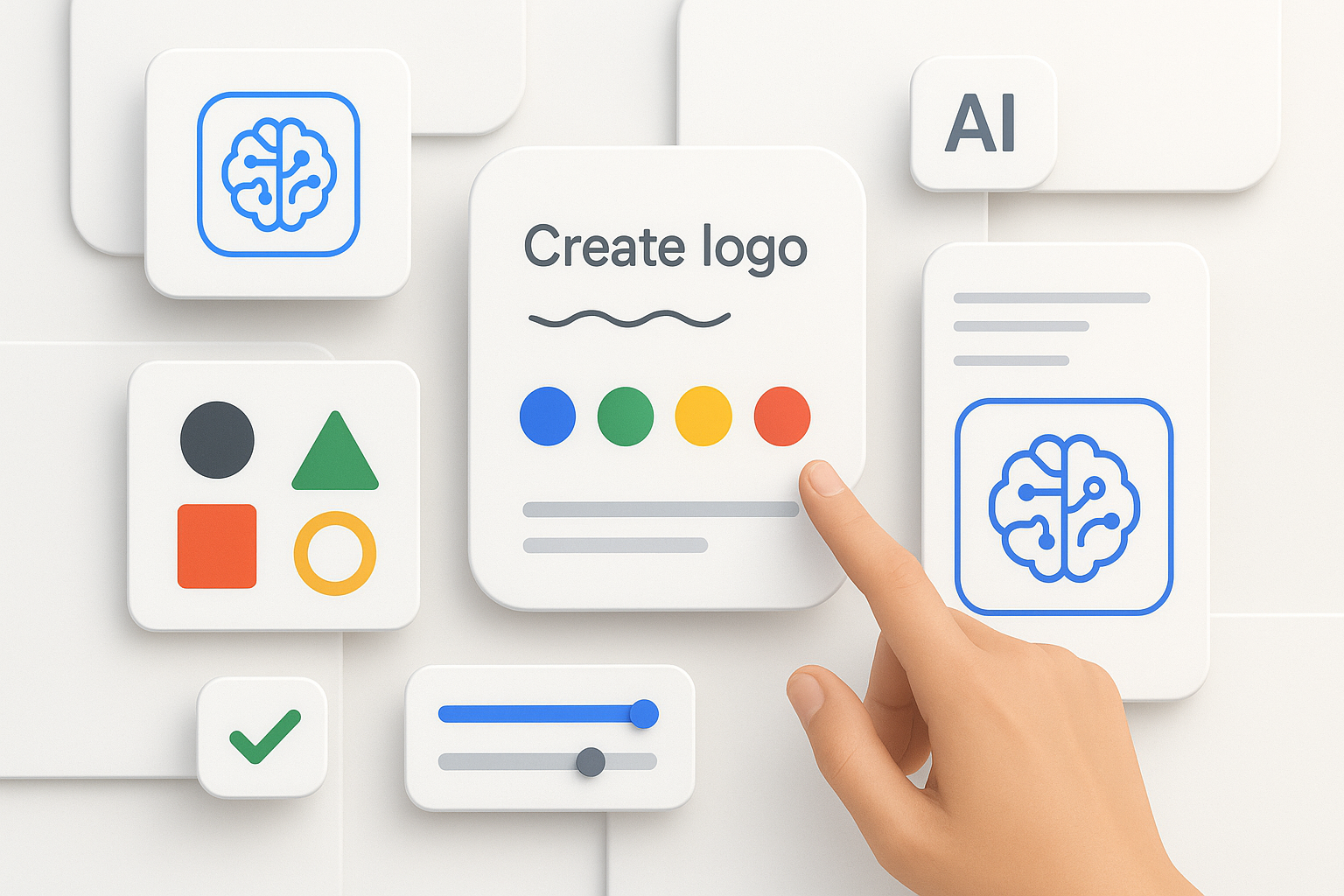
How AI Tools Can Help (Without Killing Creativity)
Modern AI logo generators don’t just throw icons on top of text. They:
- Offer layouts based on your industry
- Design principles (spacing, hierarchy, contrast) are automatically used
- Offer endless options that you can customize.
- Export logos to scalable formats, ready to work with brands.
You stay in control—AI just makes the process faster and more accessible.
Real-World Examples: Logos That Drive Action
1. TradeGrid – B2B logistics platform
- Icon: layered grid with arrow
- Typeface: bold sans serif
- Colors: steel gray + vivid orange
→ Feels industrial, forward-moving, and reliable
2. LumaGlow – Skincare ecommerce brand
- Icon: sun + droplet fusion
- Typeface: modern serif
- Colors: peach + gold gradient
→ Conveys warmth, glow, and luxury
3. StackBit – Developer tool
- Icon: stacked boxes in a stylized "S"
- Typeface: monospaced sans serif
- Colors: dark blue + neon green
→ Instantly communicates structure and speed
Final Thoughts: Your Logo Should Do More Than Sit There
A well-designed logo isn’t decoration—it’s conversion in disguise. It builds trust, creates momentum, and supports every message your brand sends.
And the best part? You don’t need to be a designer to get it right. With the right process, the right mindset, and smart tools, you can build a logo that sells your story, connects with customers, and grows your business—one glance at a time.
Article prepared by a Turbologo expert.


