James Huniford, known to everyone as Ford, is the founder of Huniford Design Studio in New York. He is a leader in the design industry, as well as an active philanthropist within the design community and beyond. In the following article, James Huniford discusses how to balance elegance and comfort, blending new and old in color designs, and what’s trending in 2023.
Interior design trends are rapidly shifting and changing to fit our moods. The focus in 2023 appears to be going bold with statement colors like rich blues, 70s yellow, and jewel tones, or aiming to create a warm and comforting space using warm-toned neutral colors including warm whites and grays. The natural world is also making its mark on interior design, with earthy tones and rich greens helping to create moody, relaxing spaces.
Below, James Huniford explains more about these color trends and how to best use them.
Go Green
Natural green colors are often considered both timeless and enduring in interior design. Unlike other color choices that may go out of style quickly, green has been used in design for centuries, and it continues to be a popular choice that withstands changing trends.
James Huniford reports that studies have shown how exposure to natural elements, including the color green, can have positive effects on one’s health and well-being. Green is believed to promote feelings of balance, harmony, and rejuvenation, making it a popular choice for interior spaces where people spend a significant amount of their time.
When paired with natural tones, textures such as wood, and natural fabrics like cotton, linen, and wool, natural greens such as sage or olive will help to create a calm and relaxing space.
 Warm Neutrals
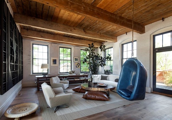
Warm neutrals have the ability to create visual harmony in a room. They are generally considered to be easy on the eyes and provide a sense of balance. James Huniford says that these colors can help unify different elements in the space, such as furniture, accessories, and artwork, creating a cohesive and harmonious design scheme.
Although commonly associated with colors like tan, browns, and taupe, lighter colors have been making a comeback in 2023. Warm whites, creams, and light beiges are proving to work especially well with other neutral staples such as linen and untreated wood to create an effortless flow throughout the home.
 Retro Yellow
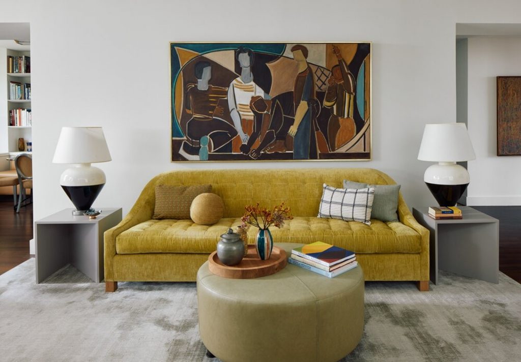
James Huniford indicates that 1970s design is looking to be a hot trend this year, and with it comes
bright, sunny yellows that are perfect for dousing kitchens and living spaces with a pop of color.
Although many might see it as a bold choice, yellow can be far more cohesive than most believe. It pairs well with darker woods, luxury furnishings, and varied textures, effectively helping to create a fun look for a joyful space, according to James Huniford.
 Bold Blues
James Huniford reports that Pantone’s color of the year is
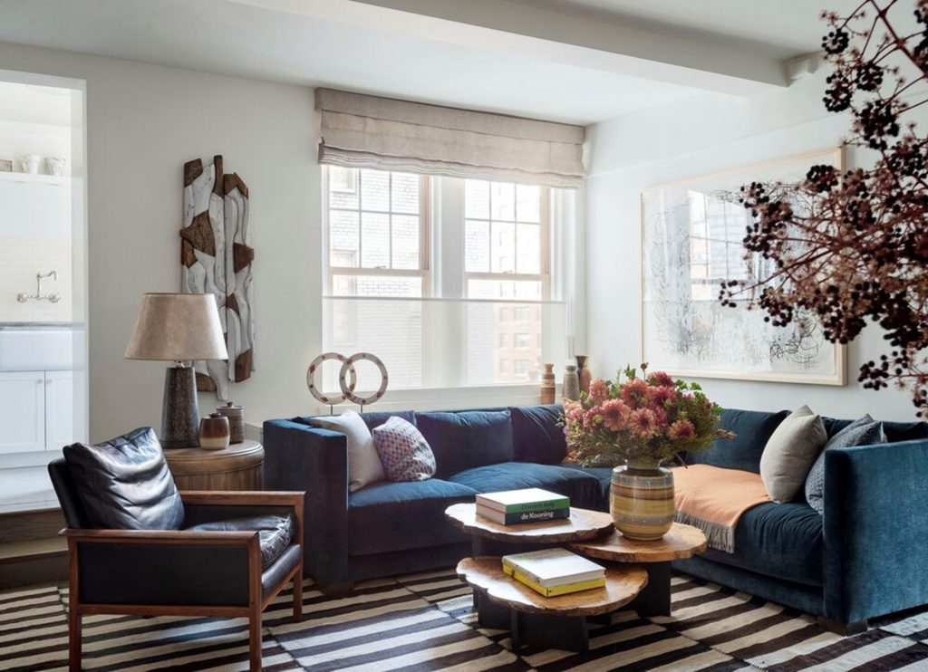
Very Peri, a dark shade of periwinkle, signifying the emergence of bold, blue-jeweled shades in the home. These colors add a sense of opulence, making them perfect for spaces such as living rooms and master bedrooms.
For those not feeling brave enough to plaster one of these rich shades onto their walls, using bold blues as accent shades on furnishings and accessories can also be a playful way to get involved with this trend and show off some creativity.
 Jewel Tones
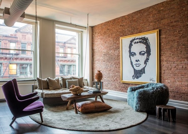
James Huniford says that jewel tones like emerald green, royal blue, amethyst purple, and ruby red are bold and vibrant, making them ideal for establishing a focal point or adding a sense of drama to any room. They have a strong visual impact and can make any space feel lively and energetic. Even when used sparingly, jewel tones create a statement, making them perfect for accent walls or just eye-catching accessories.
Many jewel tones have warm undertones, which help to create a cozy and intimate atmosphere within a room. These colors evoke a sense of warmth and comfort, making them suitable for spaces where people want to relax and unwind, such as in a bedroom or den.
 Gray Days
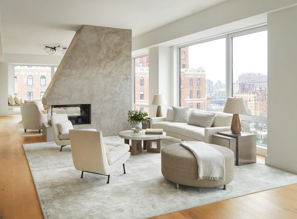
James Huniford notes that while some might see them as bland, grays are a great, warm alternative to other neutrals such as white or beige. In recent years, gray has become the top neutral color choice over its tan counterpart. Grays with a red or green base can work wonders with creating a relaxed atmosphere.
When paired with other neutral staples, gray makes for a safe, universally pleasing choice that creates a functional space and allows other aspects of the room to sing, whether it be a color pop of an accessory, a central furniture piece, or even shifting the entire focus of activity in the room.

 Warm Neutrals
 Retro Yellow
 Bold Blues
 Jewel Tones
 Gray Days