The Ocean City Board of Education voted Wednesday to adopt a new Ocean City High School athletic logo.
The teams are nicknamed the “Red Raiders,” and different varieties of raptors have flown in and out of the logos over the years — bald eagles, red hawks, ospreys and “birds that aren’t even real birds,” as Board Vice President Tom Oves put it.
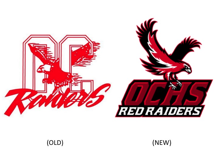
The new logo is part of an effort to provide consistency and is the result of a 10-month project, Public Relations Subcommittee Chairman Ray Clark told the full board in a presentation before the vote.
Clark said the initiative started when the district decided it was inappropriate to use the high school crest on material related to the district as a whole. In developing a new seal, the committee learned that the red-tailed hawk had been regularly used as a symbol from the school’s founding in 1881 through at least 1961, Clark told the board.
Sometime between 1961 and the present, the bald eagle became part of a popular logo, he said, though others continued to be used, including some featuring a buccaneer.
The new logo and seal feature the red-tailed hawk.
Ocean City’s colors are red and white, but the logo includes black to help make the logo “pop” on white backgrounds, Clark said.
Clark said the logo will be phased in over time when the district would normally purchase new uniforms anyway, and he said no historical murals or other depictions old logos would be destroyed.
Clark said the work was created by Keegan Design of Glassboro, which came up with hundreds of variations. He said the design can be adapted for different teams, different shapes and different words.
But not everybody was enamored of the new design.
Board member William Holmes, an Upper Township representative and Ocean City High School graduate, cast the dissenting vote in a 7-1 tally.
Patricia Dougherty, a 37-year teacher and coach at the school, said the intent of the new logo is OK, but not the execution.
She said it’s important to emphasize “Ocean City,” as the teams have always been known, and not “OCHS.” And she said most of the logos over the years have been a result of “the creativity of the kids.”
Lizbeth Canizzaro, another Ocean City High School grad, suggested the logo has too much black.
“Deep down in my heart, I bleed red and white,” she said.
In an open letter on behalf of the Ocean City High School Alumni Association, Marcia McCulley said the decision should not be made without consulting the public, alumni and current student body.
“Henry James once said, ‘It takes an endless amount of history to make even a little tradition.’ We have the history, the tradition and the emblem that for so many encompasses the pride of the Red Raider community. There may have been a need for change or editing of that logo, but not a disregard for the people who love, respect and cherish this symbol and wear it with pride, especially without consultation or contribution (of any kind) from the people you are asking to stand behind and support it.”
__________
Sign up for OCNJ Daily’s free newsletter and breaking news alerts
“Like” us on Facebook


